
Choosing the right font pairing for wedding invitations can make the difference between a stationery suite that feels generic and one that feels unforgettable. Whether you’re a designer crafting bespoke suites for clients or a DIY bride putting together your own invites, the secret lies in contrast, hierarchy, and intention.
In this guide, we’ll walk you through seven elegant combinations that work beautifully, explain the principles behind pairing scripts, serifs, and sans-serifs, and show you how to apply them to both formal and modern wedding styles.
Why Font Pairing Matters for Wedding Invitations
Your invitation is the first glimpse guests get of your wedding’s tone. A romantic script paired with a clean sans-serif tells a different story than two bold serifs stacked together. Great font pairings achieve three things:
- Contrast: Pairing fonts that are visually different prevents the design from feeling flat.
- Hierarchy: Guests should immediately know what’s most important (names, date, venue).
- Mood: The fonts should reflect whether your wedding is classic, modern, rustic, or whimsical.

The 3 Font Categories You’ll Be Working With
1. Script Fonts
Calligraphy-inspired, flowing, and romantic. Best used for names, monograms, or short emphasis phrases like “Save the Date.”
2. Serif Fonts
Classic and refined, with small strokes at the end of letters. Perfect for formal invitations and traditional weddings.
3. Sans-Serif Fonts
Clean, minimal, and modern. Excellent for body text, dates, and venue details on contemporary invites.
7 Elegant Font Pairings for Wedding Invitations
1. Tangerine + Lato (Romantic Classic)
Tangerine offers delicate calligraphy strokes that work beautifully for couple’s names, while Lato keeps the supporting details readable and refined. Ideal for garden weddings and soft, romantic palettes.
2. Playfair Display + Montserrat (Editorial Elegance)
This pairing has a magazine-cover feel. Playfair Display’s high contrast serifs create drama, while Montserrat keeps the structure modern and breathable.
3. Alex Brush + Open Sans (Effortless Modern)
Alex Brush adds a hand-painted charm without being overly formal. Combined with the geometric warmth of Open Sans, it’s perfect for outdoor and bohemian celebrations.
4. Imperial Script + Cormorant Garamond (Old-World Luxury)
For black-tie weddings in historic venues, this combination delivers timeless prestige. Imperial Script feels engraved, while Cormorant Garamond brings literary refinement.
5. MonteCarlo + Roboto Serif (Contemporary Romance)
MonteCarlo’s soft, modern calligraphy paired with the gentle warmth of Roboto Serif suits couples who want romance without tradition feeling heavy.
6. Great Vibes + Josefin Sans (Art Deco Inspired)
Great Vibes evokes 1920s elegance, while Josefin Sans adds geometric precision. A wonderful match for Art Deco themed celebrations.
7. Sweet Sans + Karla (Minimalist Modern)
Two sans-serifs done right. Sweet Sans brings stately, all-caps presence for headers, while Karla offers a softer texture for body copy. Ideal for minimalist, gallery-style invitations.

Quick Reference: Font Pairings by Wedding Style
| Wedding Style | Recommended Pairing | Mood |
|---|---|---|
| Classic Formal | Imperial Script + Cormorant Garamond | Luxurious, traditional |
| Modern Minimalist | Sweet Sans + Karla | Clean, editorial |
| Rustic Outdoor | Alex Brush + Open Sans | Relaxed, warm |
| Garden Romantic | Tangerine + Lato | Soft, dreamy |
| Editorial Modern | Playfair Display + Montserrat | Bold, sophisticated |
| Art Deco | Great Vibes + Josefin Sans | Glamorous, vintage |
| Contemporary Romance | MonteCarlo + Roboto Serif | Fresh, intimate |
Building Hierarchy in Your Invitation
Once you’ve chosen your two fonts, hierarchy is what makes them work together. Follow this structure:
- Couple’s Names: Largest size, usually in the script or display font.
- Invitation Phrase (“together with their families”): Smaller, in the supporting font, often italicized.
- Date and Venue: Medium size, sans-serif or serif body font, easy to read.
- RSVP Details: Smallest, but still legible. Use generous letter-spacing for elegance.
5 Pro Tips for Pairing Fonts Like a Designer
- Limit yourself to two fonts. Three at most. More than that creates visual chaos.
- Create contrast on purpose. Pair a decorative font with a neutral one. Avoid two scripts together.
- Watch your weights. A bold script needs a lighter sans-serif to balance the page.
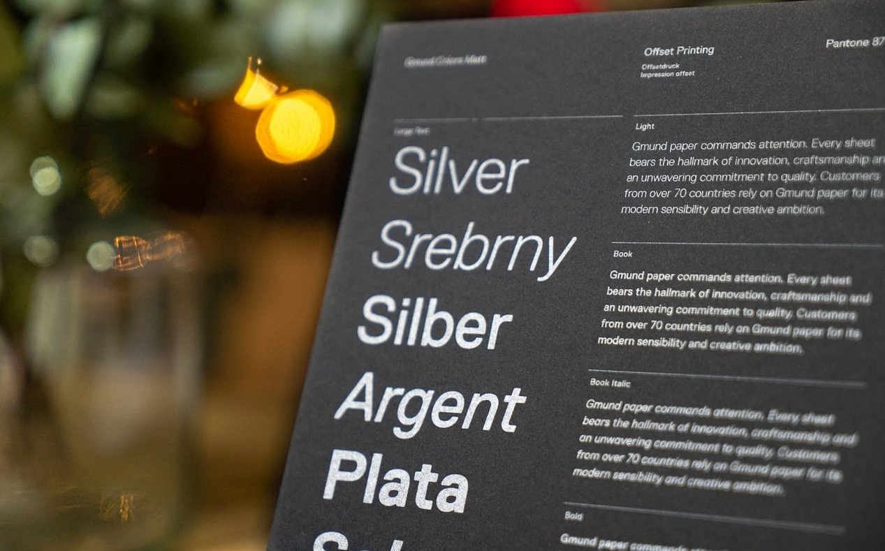
- Test in print. Fonts that look stunning on screen can lose detail on textured paper. Always do a test print.
- Mind the letter-spacing. Adding 100 to 200 units of tracking to all-caps text creates an instantly elegant feel.
Formal vs Modern: Knowing Which Direction to Take
Formal Invitations
Lean into serif fonts with subtle script accents. Stick to classic black or deep navy ink. Choose fonts with engraved or letterpress qualities like Cormorant Garamond, Bodoni, or Didot.
Modern Invitations
Embrace sans-serifs, asymmetric layouts, and unexpected color palettes. Fonts like Karla, Josefin Sans, and Montserrat give a fresh, gallery-inspired aesthetic.
Common Mistakes to Avoid
- Using two fonts that are too similar (two serifs that look almost identical).
- Pairing two highly decorative fonts. One should always be the supporting cast.
- Forgetting readability. If your guests can’t read the venue address, the design fails.
- Overusing italics or all-caps throughout the entire invitation.
- Ignoring licensing. Always check that your chosen fonts allow commercial or personal use.
FAQ: Font Pairing for Wedding Invitations
What is the best font pairing for a formal wedding invitation?
Imperial Script paired with Cormorant Garamond is one of the most elegant choices. It delivers classical luxury while keeping all details easy to read.
Can I use two scripts on a wedding invitation?
It’s generally not recommended. Two scripts compete for attention and reduce readability. If you love the look, choose one script for emphasis and a clean serif or sans-serif for everything else.
What fonts work best for modern minimalist wedding invitations?
Try Sweet Sans with Karla, or Montserrat with Playfair Display. These pairings offer clean structure with a touch of personality.
How many fonts should I use on a wedding invitation?
Two fonts is the sweet spot. Three is the absolute maximum, and only if each has a clear role (display, body, accent).
Are Google Fonts good for wedding invitations?
Absolutely. Google Fonts like Great Vibes, Playfair Display, Montserrat, Cormorant Garamond, and Tangerine are free, professional, and licensed for any use, making them perfect for DIY brides and designers alike.
How do I make sure my fonts print well?
Always do a test print on the actual paper stock you plan to use. Thin script fonts can break up on textured paper, while heavy serifs may bleed on thin cardstock. Adjust font size and weight accordingly.
Final Thoughts
The right font pairing for wedding invitations is more than a design choice. It sets the tone, communicates personality, and welcomes guests into your celebration. Start with one font you love, then choose its opposite as a complement. Build hierarchy, test in print, and trust your instincts.
Whether you go with the timeless elegance of Imperial Script and Cormorant Garamond or the modern minimalism of Sweet Sans and Karla, your invitation will feel curated, intentional, and unforgettable.