
You approve a design on screen. The neon green looks electric, the blue is deep and saturated, the pink glows. Then the printed proof arrives and everything looks flat, muddy and slightly sad. Nothing was broken. You simply hit the wall between two color systems, and understanding RGB vs CMYK is what stops it from happening again. Reference: https://boingographics.com.
This guide is written for people who actually have to ship files: catalog pages, packaging, showroom signage, product photography and web assets. Below you will find a straight comparison of both color modes, the reason colors shift, the exact conversion workflow in Illustrator, Photoshop and InDesign, and a list of the specific colors that never survive a CMYK conversion, with print-safe substitutes you can use immediately.
RGB vs CMYK in one paragraph
RGB (Red, Green, Blue) is an additive color model built from light. Screens start at black and add light until they reach white. CMYK (Cyan, Magenta, Yellow, Key/Black) is a subtractive color model built from ink. Paper starts white and every drop of ink subtracts light until you approach black. Light can produce colors that ink physically cannot, which is why a saturated screen color often has no printable equivalent. Short version: RGB for anything with a backlight, CMYK for anything with ink on it.

Side-by-side comparison: RGB vs CMYK
| Criteria | RGB | CMYK |
|---|---|---|
| Color model | Additive (light) | Subtractive (ink) |
| Channels | 3 channels, 0 to 255 each | 4 channels, 0% to 100% each |
| White is | All channels at maximum (255,255,255) | No ink at all, the paper itself |
| Black is | No light (0,0,0) | Ink combination, usually rich black |
| Color range (gamut) | Wider, especially in greens, blues and neons | Narrower, stronger in warm neutrals and browns |
| Typical uses | Websites, e-commerce photos, social posts, video, PDFs read on screen, digital showroom displays | Catalogs, brochures, packaging, labels, large format signage, business cards |
| Common profiles | sRGB, Adobe RGB (1998), Display P3 | Coated FOGRA39 / FOGRA51 (Europe), US Web Coated SWOP v2, GRACoL 2013 |
| File formats | JPEG, PNG, WebP, AVIF, SVG | PDF/X-4, TIFF, AI, INDD, EPS |
| File size | Smaller (3 channels) | Larger (4 channels) |
Why screen colors shift when printed
Four things happen between your monitor and the printed sheet:
- Gamut clipping. Any RGB color outside the printable range gets pushed to the nearest reachable CMYK color. Neons collapse first because they live at the outer edge of the RGB gamut.
- No light source. A monitor emits light. Paper reflects whatever light is in the room. A brochure under warm showroom lighting will never match a 400 nit display.
- Paper and ink absorption. Uncoated stock absorbs ink and drops contrast noticeably. The same file on coated gloss can look up to 20% more saturated than on uncoated.
- Dot gain. Ink spreads slightly on contact with paper, so midtones print darker than they preview. Modern profiles compensate, but only if you actually use the right profile.
The gamut problem visualized
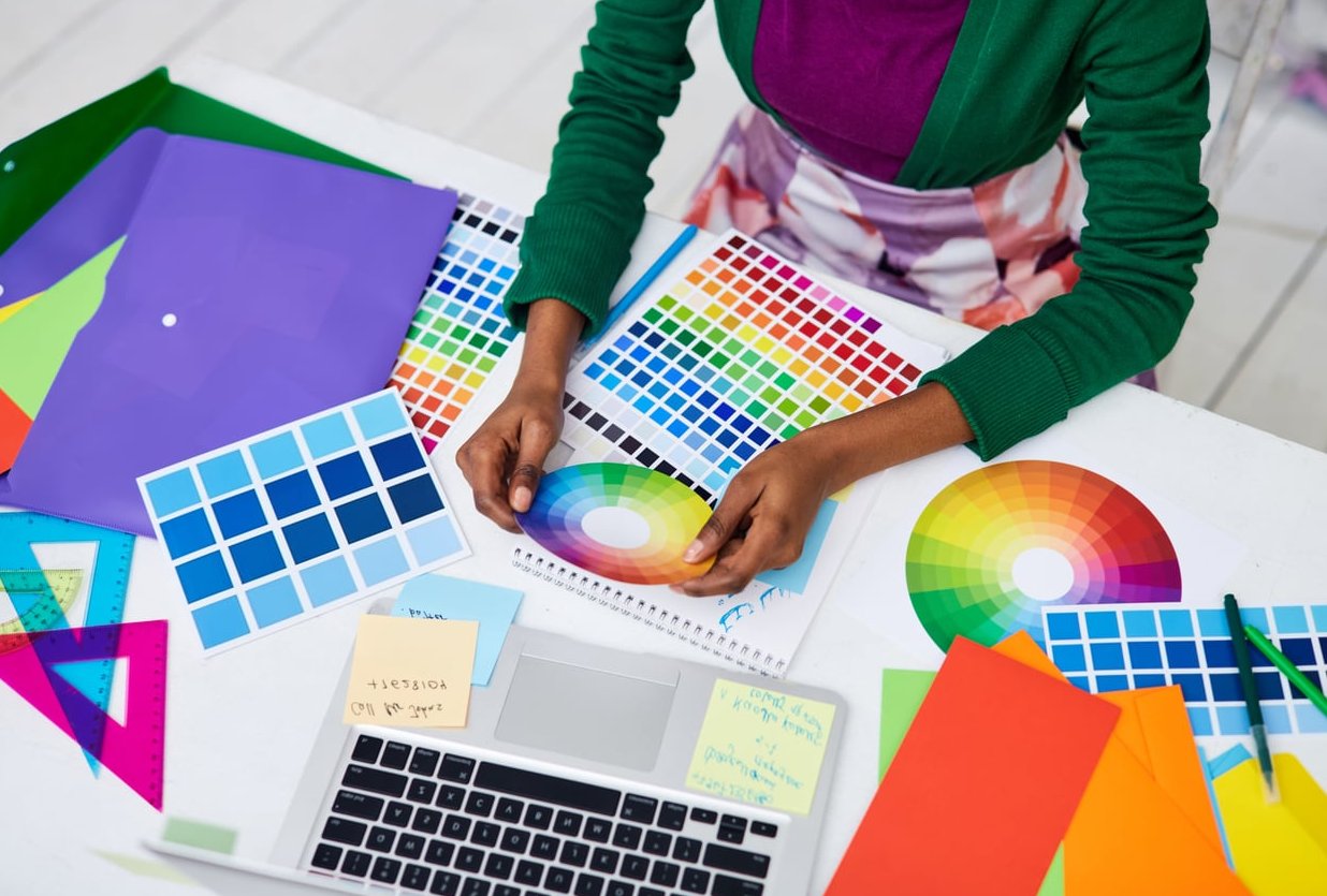
Think of the RGB gamut as a large balloon and the CMYK gamut as a smaller balloon inside it. Most photographic colors (skin tones, wood grain, fabric, stone, neutrals) sit comfortably inside both. Highly saturated primaries sit outside the CMYK balloon and have to be dragged in. That drag is the shift you see.
When to use RGB
- Websites, product pages and e-commerce listings
- Social media graphics, ads, email templates
- Video, animation, motion graphics
- Presentations and PDFs that will only be viewed on a screen
- Digital signage and in-store screens
- Photo editing and retouching (always edit in RGB, convert at the end)
Default choice: sRGB. It is the most predictable across browsers, phones and untuned monitors. Use Adobe RGB only if the whole pipeline, including the print provider, supports it.
When to use CMYK
- Printed catalogs, lookbooks and brochures
- Packaging, cartons, labels and stickers
- Posters, banners, roll-ups and large format signage
- Business cards, stationery, price tags
- Anything a commercial press or wide format printer will output
Default choice: ask your printer which profile they run. In Europe most sheetfed work uses Coated FOGRA39 or PSO Coated v3 (FOGRA51). In North America, US Web Coated SWOP v2 or GRACoL 2013 are standard. Guessing here is the most expensive mistake in the whole workflow.
What about desktop and office printers?
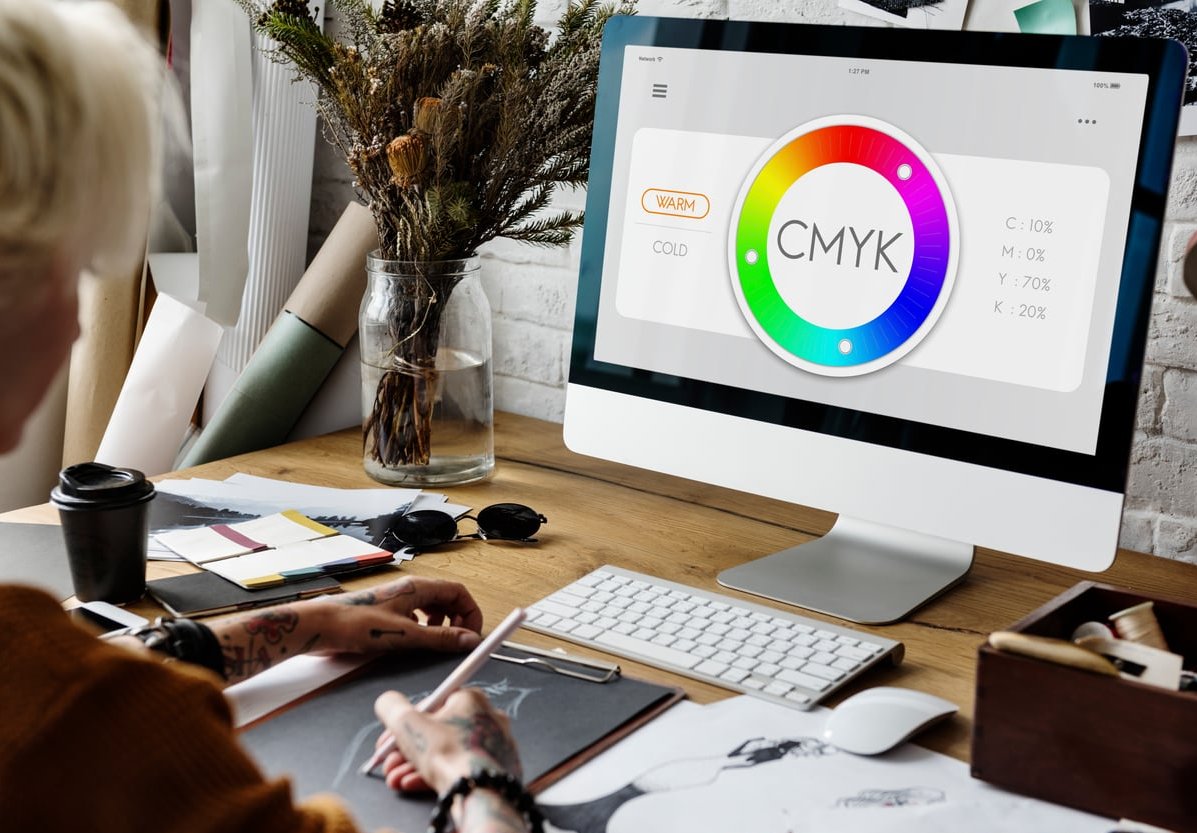
Confusingly, most desktop inkjets want RGB files even though they print with CMYK inks. Their drivers do the conversion internally and usually do it better than a manual one. Send RGB to your office printer and CMYK to your commercial printer.
The colors that never survive CMYK conversion
These are the usual casualties. If your brand or design relies on any of them, plan a substitution before the file goes out, not after the proof comes back.
| Screen color | Hex | What CMYK does to it | Print-safe substitute |
|---|---|---|---|
| Neon green | #00FF00 | Turns into flat moss or grass green, loses all glow | C70 M0 Y100 K0 for process, or a fluorescent spot ink such as Pantone 802 C |
| Electric blue | #0000FF | Shifts toward muddy violet or dull navy | C100 M80 Y0 K0, or Pantone Reflex Blue C as a spot |
| Pure cyan | #00FFFF | Becomes chalky and washed out | C100 M0 Y0 K0 (process cyan is the closest ink can get) |
| Hot pink / magenta | #FF00FF | Drops to a duller purple-pink | C0 M100 Y0 K0, or fluorescent Pantone 806 C |
| Pure red | #FF0000 | Prints as tomato or brick red | C0 M100 Y100 K0, or Pantone 485 C for a punchier red |
| Bright orange | #FF7F00 | Goes heavy and slightly brown | C0 M60 Y100 K0, or Pantone Orange 021 C |
| Vivid violet | #8B00FF | Loses saturation, reads as grey-purple | C65 M90 Y0 K0, or Pantone 2593 C |
| Lime / acid yellow-green | #CCFF00 | Turns olive | C25 M0 Y100 K0, or Pantone 389 C |
| Metallics (gold, silver, copper) | Various | Become beige and grey, no shine at all | Metallic spot inks or foil stamping, never process build |
| Pure screen black | #000000 | K100 alone looks washed out grey on large areas | Rich black C60 M40 Y40 K100 for large fills, K100 only for small text |
Two rules to remember
- Small text stays K100. Rich black on 8pt type invites registration problems and fuzzy edges.
- If a neon is non-negotiable, budget for a fifth ink. A fluorescent or Pantone spot color is the only real way to keep the glow on paper.
The conversion workflow, step by step
Photoshop: converting images
- Do all your editing in RGB. Layer effects, filters and adjustment layers behave better and you keep the wider gamut while you work.
- Turn on soft proofing: View > Proof Setup > Custom, choose your printer’s CMYK profile, tick Simulate Paper Color and Black Ink, then press Ctrl/Cmd + Y to toggle the preview.
- Check what will clip: View > Gamut Warning (Ctrl/Cmd + Shift + Y). Grey patches are out-of-gamut areas.
- Fix the problem areas while still in RGB using Hue/Saturation or Selective Color. Pulling saturation down by 5 to 10% on the offending color usually restores detail that would otherwise flatten.
- Flatten a copy, then convert: Edit > Convert to Profile. Pick the destination CMYK profile, engine Adobe (ACE), intent Relative Colorimetric with Black Point Compensation for graphics and logos, or Perceptual for photos with lots of saturated color.
- Do a final contrast and saturation pass in CMYK. Conversions almost always need a small curves boost.
- Save as TIFF or PSD with the profile embedded. Keep the RGB master file.
Never use Image > Mode > CMYK Color as a shortcut. It uses whatever is set in your working space, which may not be your printer’s profile.
Illustrator: vector artwork and logos
- Set the document mode at creation: File > New > Advanced > Color Mode > CMYK for print jobs. Changing later is possible but messier.
- To switch an existing file: File > Document Color Mode > CMYK Color. This converts swatches globally.
- Assign the right profile with Edit > Assign Profile and soft proof through View > Proof Setup.
- Rebuild brand colors by hand. Do not accept the automatic conversion for logo colors. Enter the CMYK or Pantone values from your brand guidelines directly.
- Convert Pantone swatches deliberately if the job is 4 color process only: select the swatch, open Swatch Options, change type to Process and mode to CMYK, and check the result against a printed Pantone bridge guide.
- Watch out for effects. Drop shadows, glows and transparency created in RGB mode can shift when the document mode changes. Check Effect > Document Raster Effects Settings and set it to 300 ppi CMYK.
InDesign: assembling the final file
- Set Edit > Color Settings so the CMYK working space matches your printer’s profile and RGB is sRGB or Adobe RGB.
- Leave placed RGB images as RGB in the layout. InDesign converts them properly on export, and this preserves the widest gamut until the last possible moment. This is called late binding and it is the professional approach.
- Build all swatches created inside InDesign as CMYK or as clearly named spot colors.
- Use the Separations Preview panel (Window > Output) to check ink coverage. Set the Ink Limit view to your printer’s maximum, typically 300% for coated and 240% to 260% for uncoated or newsprint.
- Run Window > Output > Ink Manager and tick All Spots to Process if the job is 4 color only.
- Export with File > Export > Adobe PDF (Print), preset PDF/X-4, and under Output set Color Conversion to Convert to Destination (Preserve Numbers) with your destination profile. Preserve Numbers protects existing CMYK values from being re-converted.
- Open the exported PDF in Acrobat Pro and use Print Production > Output Preview to confirm total ink coverage and separations before sending.

A repeatable process for mixed print and digital projects
The cleanest way to handle RGB vs CMYK across a brand is to keep one master and derive from it:
- Shoot and edit everything in RGB at high resolution. This is your archive.
- Define brand colors in three coordinated forms: HEX for web, CMYK for process print, Pantone for spot print. Publish all three in the brand guide so no one improvises.
- Export web assets from the RGB master (sRGB, 72 to 150 ppi, JPEG/PNG/WebP).
- Export print assets by converting a duplicate to the target CMYK profile at 300 ppi.
- Approve print colors on a physical proof, never on a monitor.
Small habits that prevent big reprints
- Calibrate your monitor. An uncalibrated screen makes every color decision a guess.
- Ask the printer for the profile and the paper stock before you start designing, not after.
- Order a hard copy proof on the actual stock for any run above a few hundred pieces.
- Keep total ink coverage under the limit. Four channels at 100% each is 400% and will smear, offset and refuse to dry.
- Name your files clearly, for example catalog-cover-CMYK-FOGRA39.pdf, so nobody sends the web version to press.
Frequently asked questions
Is it better to use CMYK or RGB?
Neither is better in absolute terms, they solve different problems. Use RGB for anything displayed on a screen because it has a wider gamut and smaller files. Use CMYK for anything printed with ink, because that is what the press actually mixes. The mistake is not choosing the wrong one, it is choosing without knowing where the file will end up.
What happens if you print RGB instead of CMYK?
The RIP or printer driver converts it for you with default settings, and you lose control of the outcome. In practice, bright colors flatten unpredictably, blacks can print as a thin grey, and some print providers reject the file or add a conversion fee. Occasionally the result is fine, but you are gambling on someone else’s default profile.
Why don’t printers use RGB?
Because presses put ink on paper and ink is subtractive. There is no red, green or blue light source in a printed sheet, only pigment absorbing wavelengths from the room’s light. Cyan, magenta and yellow are the subtractive primaries, and black is added because mixing the three inks produces a muddy brown rather than a true black, and because black ink is cheaper than triple coverage.
Is JPEG RGB or CMYK?
JPEG supports both, but in real life almost every JPEG you encounter is RGB. Browsers, phones and most social platforms expect sRGB and may render a CMYK JPEG with inverted or broken colors. For print, use TIFF or PDF instead of JPEG whenever you can.
Can you convert CMYK back to RGB?
Technically yes, practically it is a one-way street. Once colors have been clipped into the smaller CMYK gamut, the lost saturation does not come back. A CMYK to RGB conversion gives you a file that displays correctly but still looks dull. Always keep the original RGB master.
Which rendering intent should I choose?
Use Relative Colorimetric with Black Point Compensation for logos, flat brand colors and designs where accuracy of in-gamut colors matters most. Use Perceptual for photographs with many out-of-gamut colors, because it compresses the whole range smoothly and preserves the relationships between tones.
Do Pantone colors solve the RGB vs CMYK problem?
They solve part of it. A spot color is a pre-mixed ink, so it prints exactly the same on every run and can reach colors CMYK cannot, including fluorescents and metallics. The trade-off is cost, since each spot ink is an extra plate. Many brands use process CMYK for photography and one spot color for the logo. The reasoning is set out in this piece.
The bottom line
The RGB vs CMYK debate is not about which mode wins. It is about controlling the conversion instead of letting it happen by accident. Work in RGB, soft proof against your printer’s real profile, fix out-of-gamut colors before converting, substitute the colors that cannot survive, and approve on paper. Do that and the printed piece will look like the file you designed, not a faded copy of it.